La Liga
Rebranding proposal
Client
Mediapro
Credits
Done at Interzona films
Role: Look development and graphic design
The creation of a new channel implies implementing strong corporate bases, so it is important to create a graphic line with a typography, basic colors and shapes that represent it. In addition, a concise naming that can function properly in the process of promoting and implementing the on air and off-air channel is essential.
In this case, the League precedes with a logo and corporate colors. Although to apply it as a channel image, the pragmatism of a concise range of colors and that identifies a channel as a brand, a new color line is proposed, so that in this way, the channel brand with that of La Liga can function independently Official.
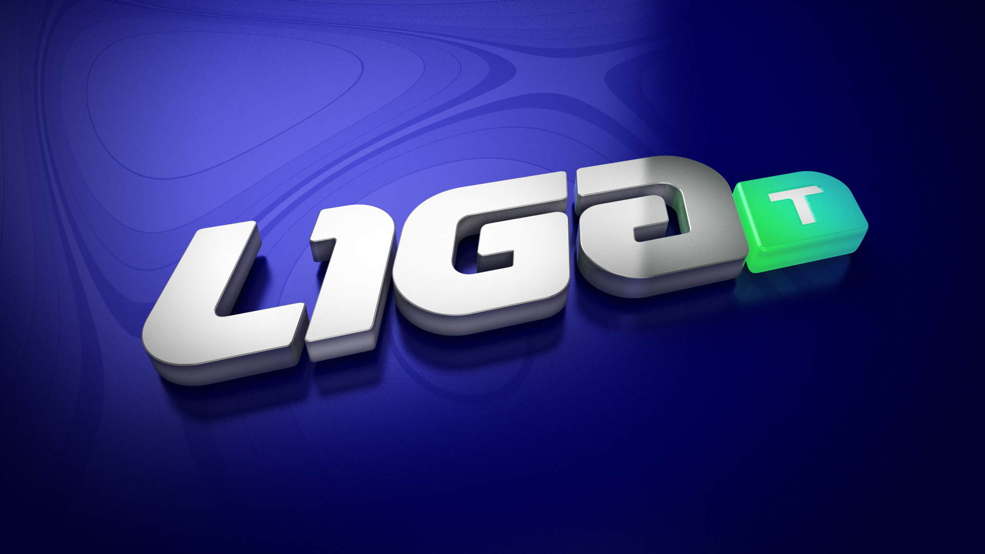
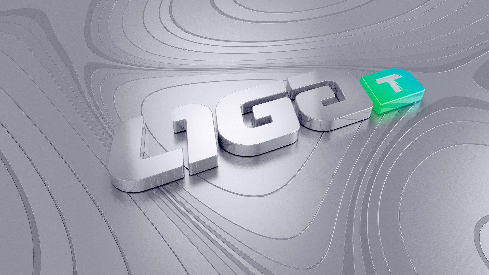
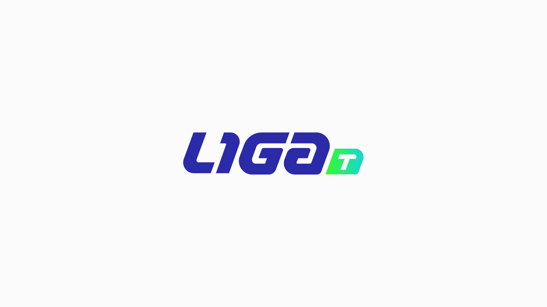
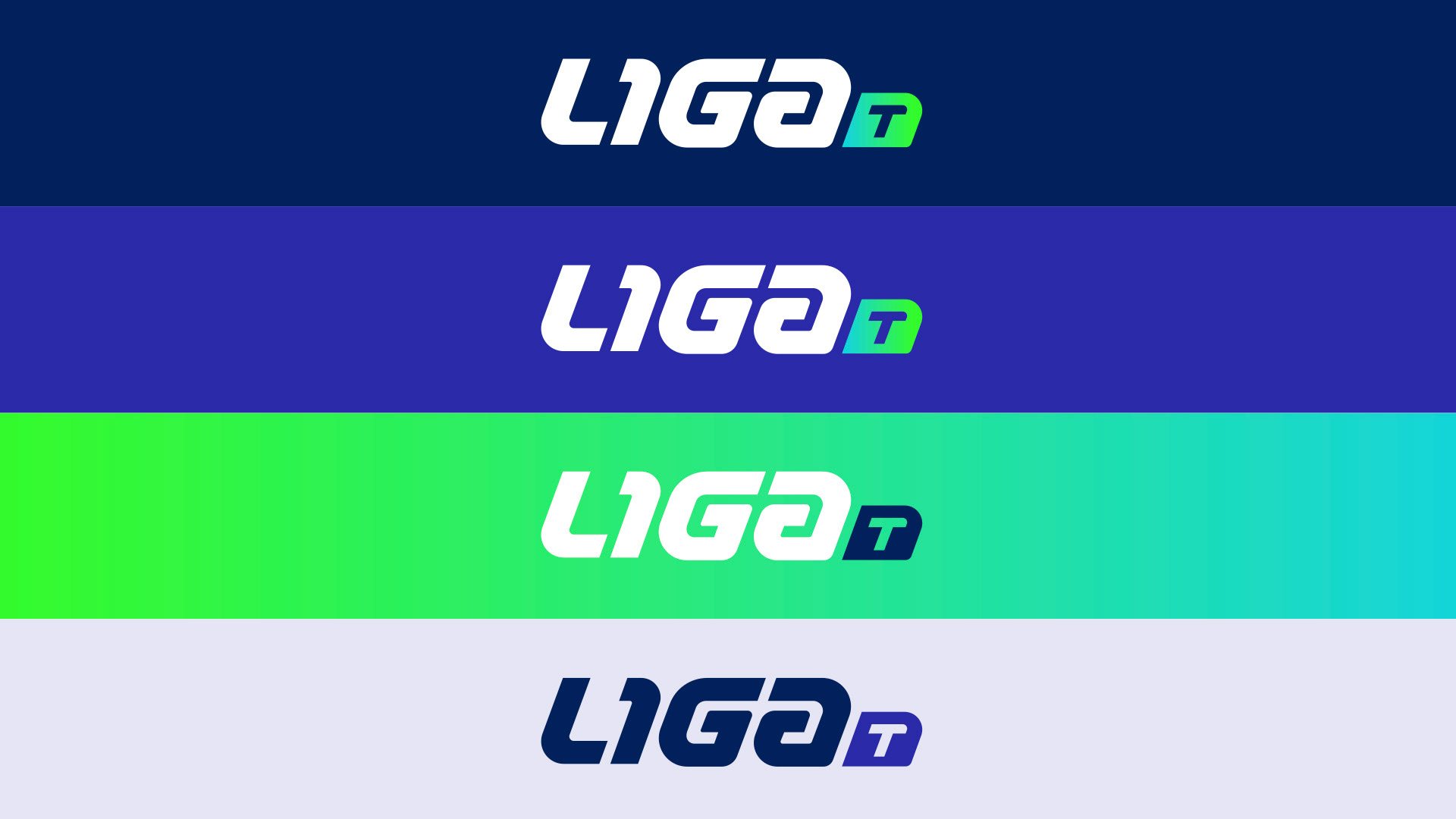
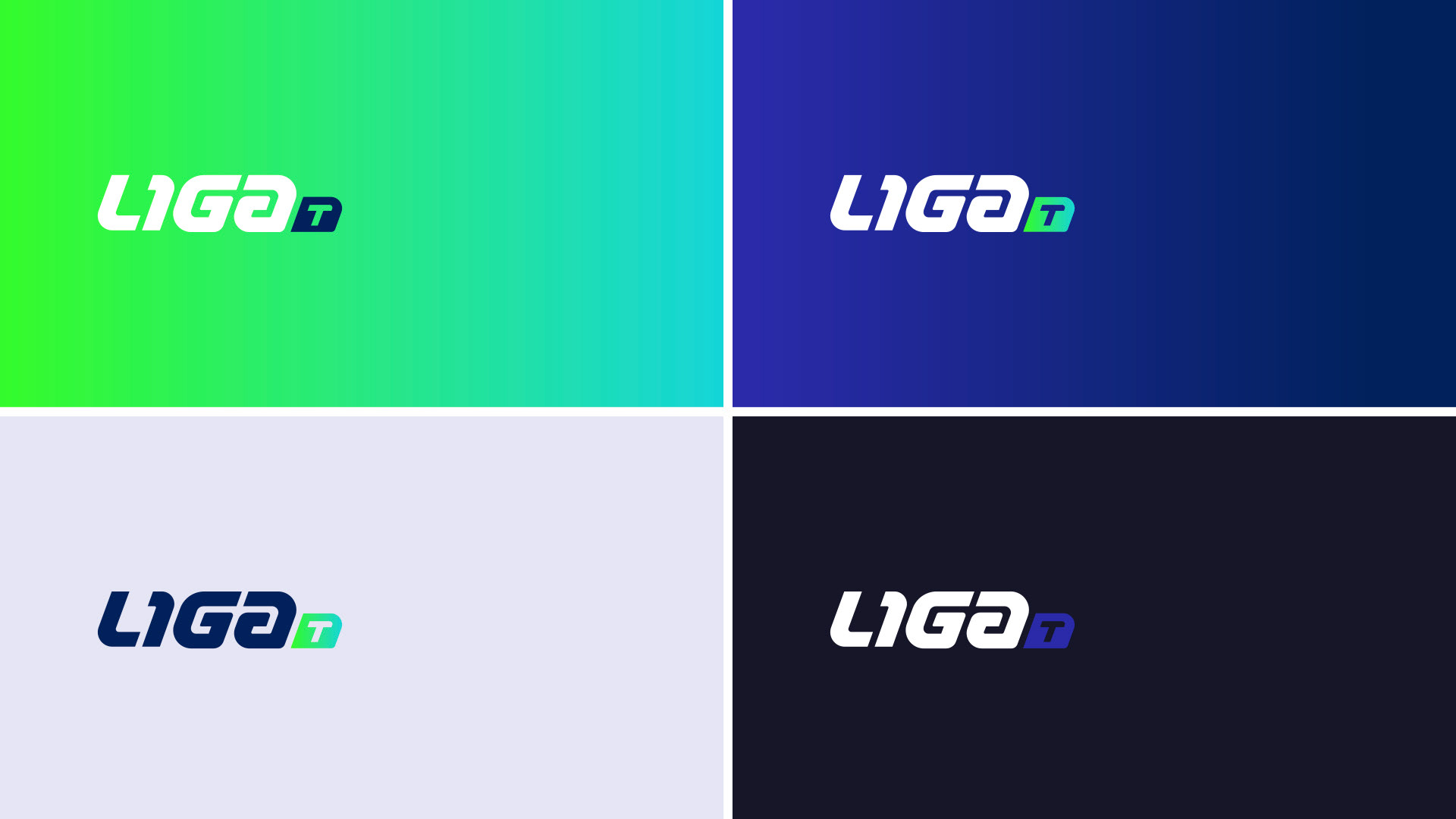
Main Logo & Aplications
The nameig of the new channel is synthesized from a Liga T. The logo of the channel has been created following a sporty and modern line. The diagonal of the typography and its circular and straight forms make up the essence of the typographic design.
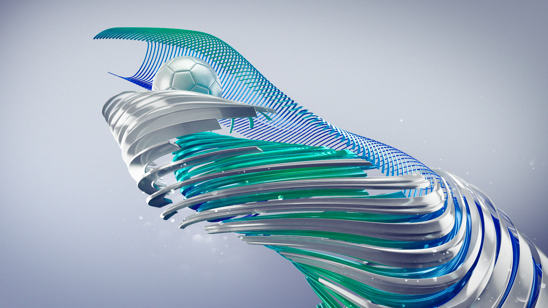
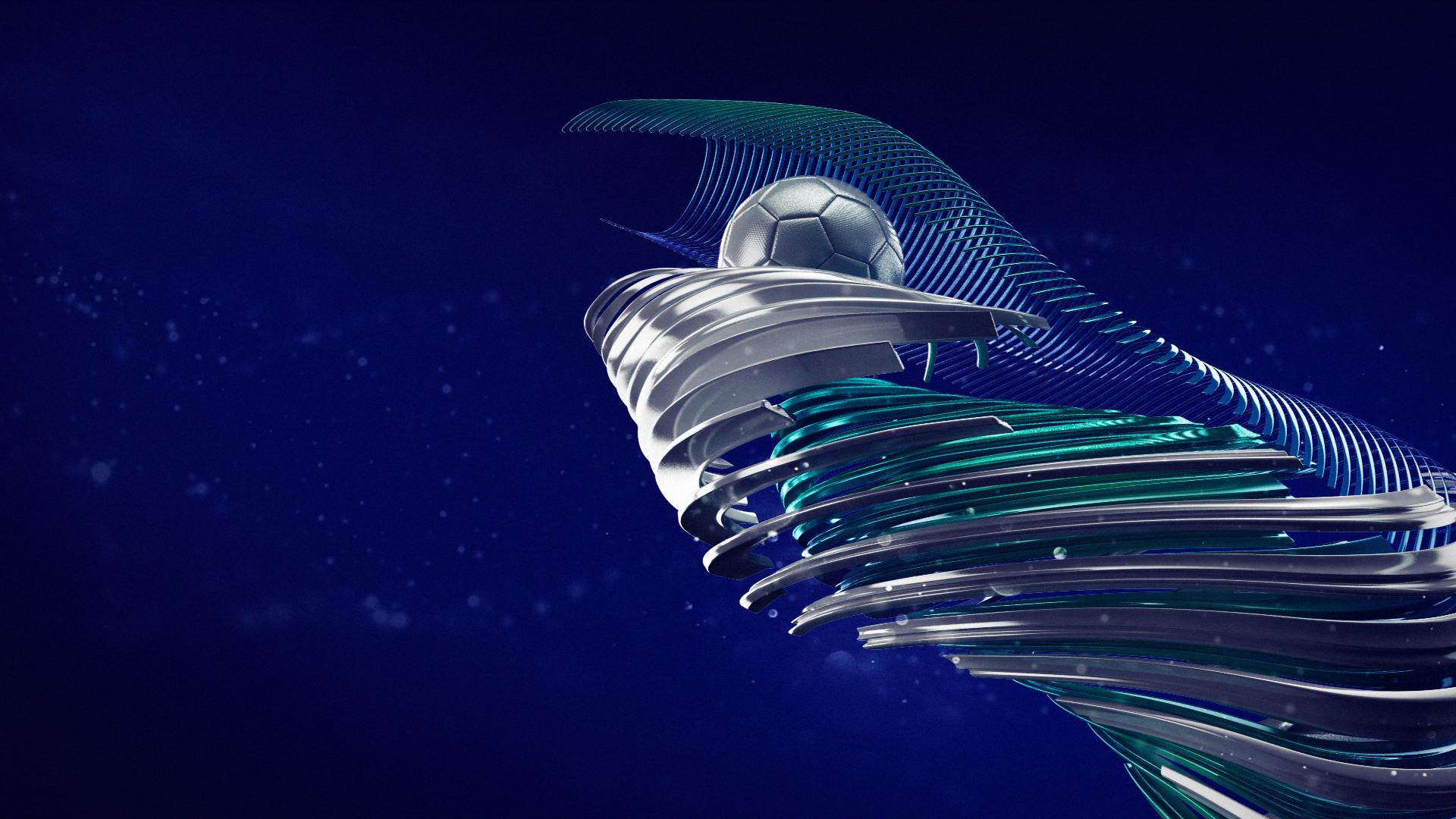
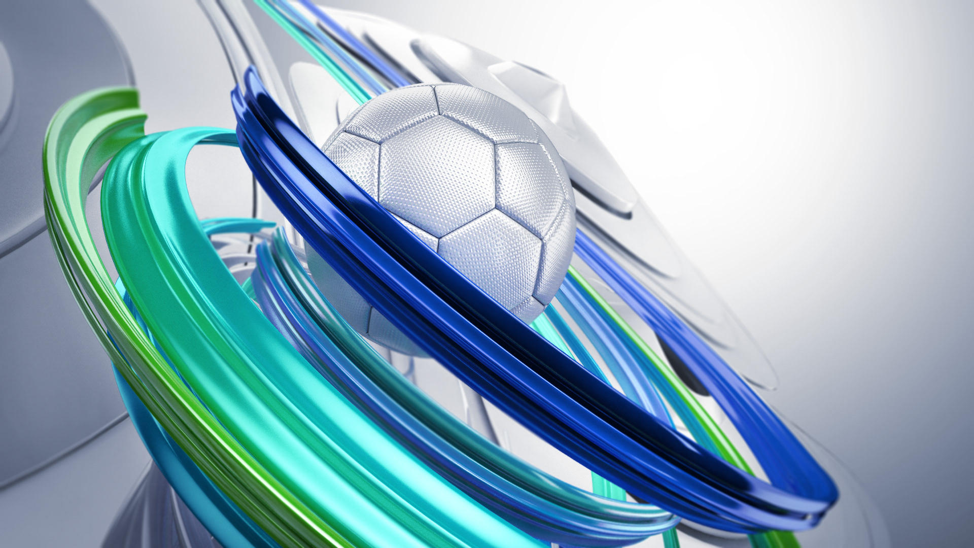
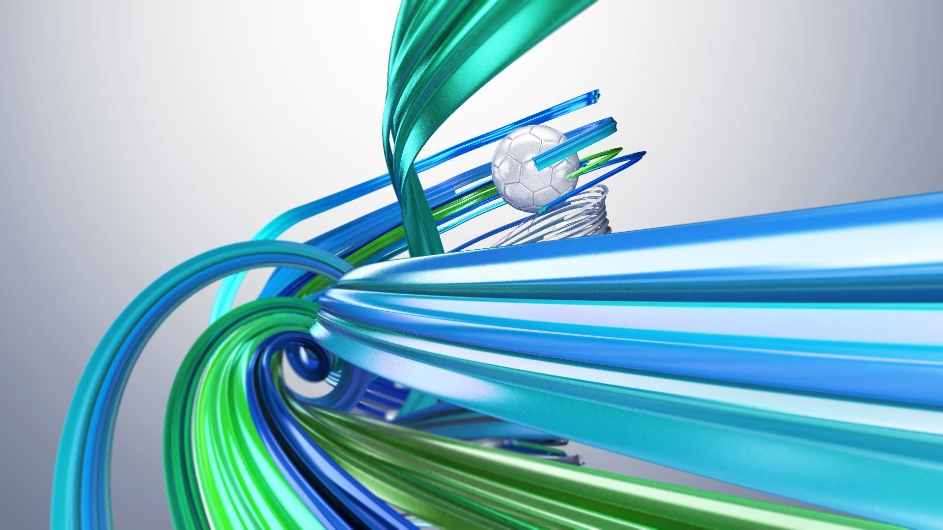
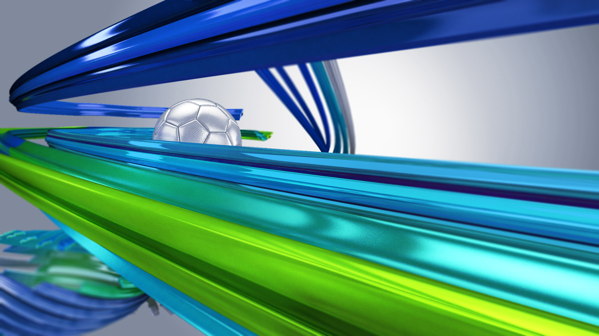
The corporate colors will be an electric blue combined with light blue and green (grass). All colors that are usually associated with football. The entire color spectrum can be combined with each other, opening the possibilities when designing the different pieces on air of the channel, as well as the application in print.
Styleframes
Movement, dynamics, action, feints, bargaining are some of the concepts of football. The narrative thread of the identifiers is shown through a journey between the architecture of the “Liga” world (explained in the case study of this project). Glowing ribbons dressed in the corporate color of the channel, guide us in this world to meet the leitmotif of history: the ball.